NOTE: This post is inspired by a recent Substack post from Steve Kirsch, and also a relevant post by the evidence-based medicine researcher, Tom Jefferson.
When the CDC attempts to compute weekly deaths from combined “pneumonia and influenza (P&I)” — then the estimates run from about 625 total national deaths in a week (89 total deaths a day) up to about 2,930 total national deaths in a week. Those are the extreme values you find when using published 2014-2019 numbers.
When adjusted to U.S. population size, then the weekly P&I deaths per 100,000 run from 0.19 weekly P&I deaths per 100,000 up to 0.90 weekly P&I deaths per 100,000. But look at what CDC claims for COVID deaths in a January week in 2022:
According to CDC, that week of January had so much COVID death in it that it was 37 times higher than anything we’ve ever seen over the last decade — i.e., going back to 2014. But COVID was never 37 times more lethal than other respiratory diseases, so explaining a respiratory death rate that is 37 times the previous maximum is hard to do.
Even more important, the date above indicates the time when Omicron variant had supplanted all other types of COVID variants — and Omicron was never more lethal than the common, seasonal flu.
How can a disease not more lethal than flu, cause a 37-fold increase in the death rate?
That’s the $64,000 question, but the answer is actually pretty easy:
It can’t.
The follow-up question is: If it is not even bio-medically possible that those January deaths were from COVID, then what in the world actually killed those people?
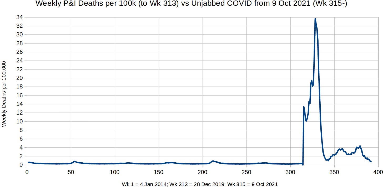
Here is a graph with normal weekly P&I deaths per 100,000 on the left side of it, but with the purported weekly COVID deaths per 100,000 unvaccinated on the right:
After the first 313 weeks of P&I deaths, the Week 314 value was set to 0, but there are actually over 60 weeks in between Week 313 (28 Dec 2019) and Week 315 (9 Oct 2021). I only separated them by a single week so as to bud them up together to show the contrast.
While the weekly respiratory death rate data shows how historically ludicrous that CDC’s numbers are for Omicron COVID, a previous criticism of CDC numbers reveals that combining pneumonia with influenza appears to have been a strategy used by CDC in order to make the flu look bad (to make flu seem deadly):
If only 257 to 3,006 people die from flu each year in the entire United States, then why are we giving out flu shots? With more than 700,000 dying from heart disease each year, wouldn’t the money be better spent on treatments for heart disease? Shouldn’t we be focusing on things which are more than 230 times more likely to kill you?
The evidence suggests that the CDC plays “fast-and-loose” with numbers and curates them in a special way so as to make it seem as if respiratory diseases are more fatal than they actually are.
Reference
[CDC’s COVID numbers] — https://www.cdc.gov/mmwr/volumes/72/wr/mm7206a3.htm
[graph of CDC’s COVID numbers] — https://ourworldindata.org/grapher/united-states-rates-of-covid-19-deaths-by-vaccination-status
[weekly P&I deaths for the 313 weeks to the end of 2019] — https://data.cdc.gov/NCHS/Weekly-Counts-of-Deaths-by-State-and-Select-Causes/3yf8-kanr
[CDC’s flu and pneumonia numbers] — https://aspe.hhs.gov/cdc-influenza-deaths-request-correction-rfc


