

Accumulated World Excess Death
Accumulated World Excess Death
Relation to the level of uptake of COVID vaccines

Pandemics can come in waves and the waves typically coincide with seasons. The greatest single reason why waves typically peak in winters is the lowered vitamin D people have when they’ve been out of the sun for the winter months.
That’s because high levels of vitamin D, typically from exposing your skin to sunlight, help stave off acute respiratory disease.
All multi-wave pandemics which span longer than 12 months have had reductions in their peaks, so that second waves are never even 80% as strong as first waves.
Critics like to point to the 1918 Spanish Flu as a multi-wave pandemic spanning longer than 12 months, where the second wave peaked higher than the first, but this can be explained by the relation to vitamin D status.
Let’s grab a time-series graph from the CDC, which shows the 3 waves of the 1918 Spanish Flu …

The graph is at right and you can see by the caption below that the time-series begins at left with March of 1918 (the end of the 2017/18 Winter). Primarily because vitamin D levels rise after March of every year — as people get out in the sun — this “wave” wasn’t able to cause many deaths.
Because the first “wave” didn’t even start until March, it didn’t have the time needed in order to build up during a time when vitamin D levels were low. It fizzled out by summer when people got more sunshine.
The second wave is then the first full “true” wave according to the relation to vitamin D. And, as has always been the case with acute respiratory disease, the wave after is not even 80% of the prior wave.
Epidemiology has given us several reasons for that:
Either the ultra-frail or ultra-susceptible cohorts shrank during the prior wave, or the virus mutated into a less-lethal variant, or the exposure from the prior wave brought herd immunity into the picture, or the improved therapeutics from treating the prior wave helped.
Or all of the above.
Because of the relation to vitamin D, a “true” (full) epidemic wave in the northern hemisphere has either peak specimen positivity before February begins, or peak disease burden (hospitalization) before March begins. Here is a CDC chart of 10 flu seasons, showing that later peak disease burdens correspond with lower burden overall.

All of the multi-wave evidence points toward waves getting smaller over time, and none of it points toward waves getting larger over time — or even waves staying as large as prior waves.
But the experience with COVID is different from all past pandemics. Here is the accumulation of excess death for 2020 and 2021 (and even the first part of 2022). Notice how the total accumulation of excess death is now almost 20 million.
For perspective, in the 4.5 years of fighting in World War I (Summer 1914 to Winter 1918), there were 16.5 million who died, worldwide.
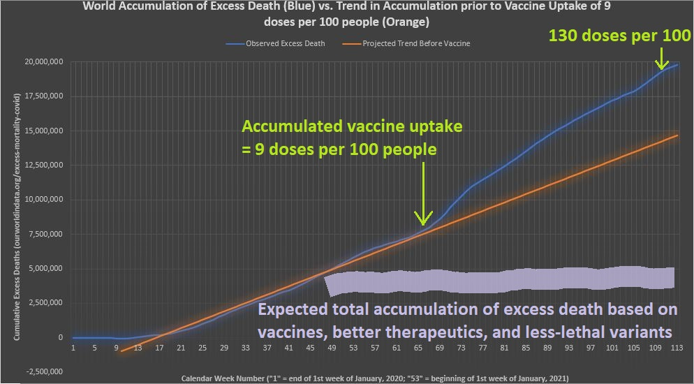
Notice that the orange line is merely a projected trend from the deaths seen prior to substantial vaccine uptake, but the thick gray line shows what is expected from the principles of epidemiology described above as the reasons that second waves are never as high as the first.
The most disturbing part is that not only did cumulative excess mortality not level off, but it didn’t even follow previous trend — so that even higher accumulation of excess mortality was found as vaccine uptake increased.
It was even increasing beyond trend after 130 doses of vaccine were administered for every 100 people worldwide — a level of uptake which implies that at least 50% of the population are fully-vaccinated, and possibly up to even 60% of everyone.
Here is the graph of vaccine uptake levels on a “per 100 persons” basis:
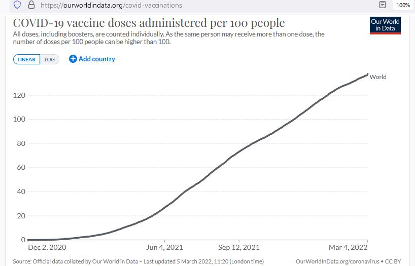
By the time that vaccine uptake levels exceed about 90 doses per 100 people, less than 10% of all accumulated doses which have been administered would go to the “never vaccinated” (so that that dose is their first dose).
This means that, when over 90 doses are given per 100 people, then over 90% of all vaccine doses administered are in people who took 2 shots.
Let’s verify this by looking at continents with different levels of vaccine uptake:

This graph is the percentage share of “ever vaxxed” and is broken down into percentage share of “fully vaxxed” and “single vaxxed.” When you see a %-sign, you are looking at a percentage share.
It is a graph of “vaccine coverage” but you would need another graph for “vaccine uptake” — something measured in total number of doses administered per 100 people (like the graph above this one).
As you can see in the graph above, with the exception of Africa (<30 doses per 100 people) the light-green areas at right which represent the share of single-vaxxed people never exceed 15% of the size of the dark-green share at left (the fully-vaxxed).
And each percentage of the dark-green share got 2 doses, while each percentage of the light-green share got just one. When you total all of the doses and put it into units of “doses per 100 people” — the fully-vaccinated represent at least 93% of the total.
Taking 93% of the total, and then dividing by 2, gives you an estimate of how many are fully-vaccinated. If vaccine uptake is 108 doses/100 people, then you would take 93% of 108 and it would give you 100.
Dividing this result by 2 gives you 50, meaning that — when 108 doses have been administered for every 100 people — about 50% are estimated to be fully-vaccinated.