

An Excess Mortality Standard -- Part 1
An Excess Mortality Standard -- Part 1
Applying a constant standard to COVID outcomes

The Relation of Constant Standards to Justice and Truth
One of the things that criminals hate is standards. If there is a standard that says you can’t steal money, criminals may try to argue around it — such as by saying that you ought to be able to steal from others, if you find yourself in special situations.
Then you may notice that the criminal is always in a special situation, so that the standard never applies to him. That’s how criminals think: keep everything fluid, so that no crime sticks to you.
Even an arbitrary standard, if held constant, can be better than no standard at all though. Survivors of concentration camps say that it wasn’t hard because of strict rules or even because of harsh rules — but because the rules were changing all of the time.
One day you might be able to take a half-hour of free time. The next day, you get no free time. People who run concentration camps think like criminals: keep everything fluid, so as to mentally agonize your prisoners, along with your physical abuse of them.
Arbitrary Standards, if constant, are Better than No Standards at all
A somewhat-arbitrary standard can be set up regarding excess mortality. If a disease is an emergency or a crisis, it will create higher excess mortality than typical diseases.
Typical diseases are able to create excess mortality in the neighborhood of 100 to 200 extra annual deaths per million. In a nation of 332 million, such a disease might cause 33,200 to 66,400 deaths in a year.
An example is the flu from Fall of 2014 to the Spring of 2015 in the USA, when just over 50,000 died. But typical diseases like seasonal flu are not cause for emergency. They do not represent any kind of a national medical crisis. So you need to find a higher standard to define what constitutes "crisis."
You need a benchmark for "crisis level" mortality.
A Benchmark against which all Death Outcomes can be Evaluated
One possibility for a critical threshold level of excess mortality -- which can be considered "crisis level" -- would be that of the pandemic flu of 1957 and 1958 (the "Asian Flu"), which led to 670 excess deaths per million in the USA.
The CDC reports that 116,000 Americans died during the Asian Flu, and that was back when the US population was 173 million. That gives us about 670 deaths per million. If your annualized excess death is above 670 deaths per million, your nation is in crisis.
If it is below 670 excess deaths per million, then you are not in a "national medical crisis."
Beyond the crisis-level of death would be an even worse state: catastrophic-level death. That's the kind of death you would expect to be seen in world wars, for instance. The annualized excess death rate of WWI works out to about 3800 deaths per million when accounting for both sides and for 4.5 years of war (summer of 1914 to winter of 1918).
What follows is a 23-region evaluation based on a single standard of "crisis-level" death in two time-windows: (1) excess death prior to vaccine rollouts and (2) cumulative excess death overall. Regions are presented in alphabetical order.
How to Read the Charts
Up to three lines are in each chart, a red curve, a black curve, and a purple horizontal line. The red curve represents accumulated excess mortality. When it is rising, excess deaths are accumulating. Where it is flat, no excess deaths are present.
The black line represents the accumulated COVID death as reported by the governments of the regions. This line is not as important as the red line. Not only has COVID death reporting become controversial over there being a complete lack of a constant standard — but governments can also even “lie” about how much of their death is COVID death.
If 100% of all deaths were COVID deaths, but the total death rate was far below expected death — no excess mortality at all — then that’d represent progress. Death is an absolute standard of harm. It is one hard way how you can measure whether you succeed or fail in treating a disease.
We’ll mostly ignore the black lines then, so as to keep focus on red and purple.
Where shown, the horizontal purple line represents a “crisis level” of death akin to what was seen with the Asian Flu of 1957 and 1958. In order to find the height for it, the populations of the regions were used along with a “crisis level” annual excess death rate of 670 deaths per million (M).
There is usually just under a year before vaccines, and just over a year with vaccines. When using the constant standard of 670/M, you can watch to see if crisis level death had been reached prior to vaccine rollouts and, from that point forward, you’d watch for a doubling of height above the purple line.
In this way, you measure or evaluate what is being accumulated within the relevant time-window only.
First up, is Austria …
Austria (pre-vaccine)
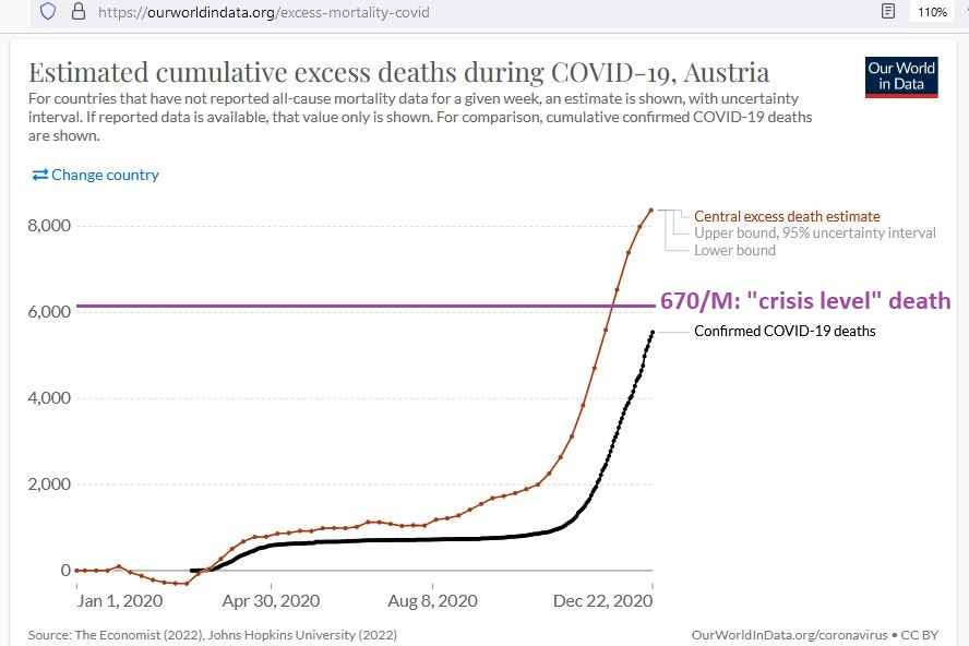
Notice how, at a population just over 9 million, a “crisis” level of death of 670/M for Austria would represent just over 6000 annual excess deaths. The vaccine rollout for Austria was 23 Dec 2020, so this first chart represents all mortality events leading up to the vaccine rollout.
The red line represents the accumulated excess death, or deaths beyond what had been expected for the year. Austria is one of the few regions where there was a “COVID crisis” (excess death beyond 670/M) before the vaccines had rolled out.
But notice how it only even began approaching crisis level in the few weeks prior to rollout. There had been nothing in Austria even approaching a COVID crisis up to at least August of 2020.
Austria (post-vaccine)

The excess death which accumulated after the vaccine rollout in Austria was roughly equal to that found before. You can tell how by envisioning a height that is twice the height of the purple line.
Next up, is Denmark …
Denmark (pre-vaccine)
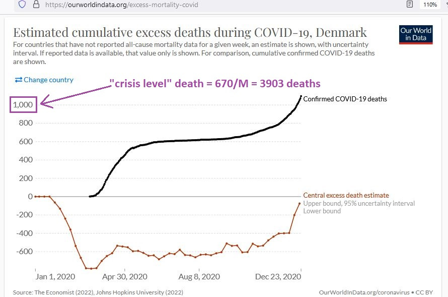
Notice how, prior to the vaccine rollout, there was never a time when there was a COVID crisis in Denmark — using a constant standard of 670/M excess deaths. Looking all of the way up to the very day before the vaccine rollout, there had been no (“zero”) accumulation of excess death there.
But, like in Austria, in the few weeks leading up to the vaccine rollout, you begin to see a rise in excess death. Let’s record what happened after vaccines rolled out …
Denmark (post-vaccine)
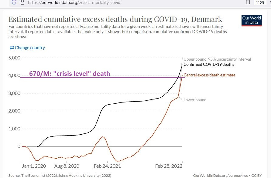
From the previous graph, you can see how there was an undulating “S” curve of excess death, peaking above zero before falling again, only to begin rising exponentially, after vaccine coverage of the population of Denmark had expanded.
By February of 2022, Denmark ended up with crisis level death, but essentially all of the excess death was post-vaccine (no excess death prior to vaccine rollout).
Next up, is Finland …
Finland (pre-vaccine)
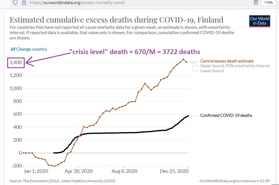
Finland was in worse shape than Denmark prior to vaccines, reaching a level of excess death that was approximately half of crisis-level death. Curiously, just like in Denmark, mortality was less than expected in the first few months of 2020 (red line is falling rather than rising or stable).
This had even been true of Austria to some extent, and future investigation should look into why deaths in several regions were dropping early in 2020 — before COVID struck. One perverse hypothesis is that those deaths were being “saved” in order to pad the “death accounts” of COVID later (a perverse accounting trick).
Only further investigation could rule out that hypothesis.
Finland (post-vaccine)
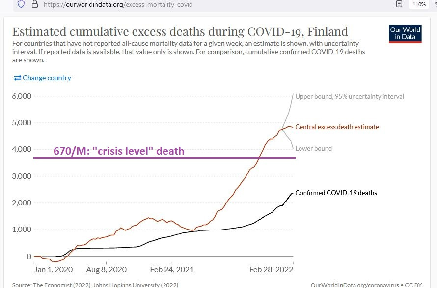
Like Denmark, Finland was also able to reach crisis level death, but only after the vaccine rollout. Just like in Denmark, there was an inflection point after February, when it can be expected that vaccine coverage had expanded.
Approximately 10 doses per 100 people had been administered by March in both regions, so that the several-months-long, constantly-steep rise in excess mortality post-February coincides with vaccine uptake levels that are beyond 10 doses per 100 people.
Importantly, the continual rise in excess death did not slow down, even after 100 doses had been administered per 100 people — which roughly represents at least 40% being fully-vaccinated (with only a minority of the 100 doses being “single-shot-only” doses which had not been followed-up with a second dose).
That point bears repeating:
When vaccine coverage grew to the point where population-wide effects of vaccines are expected to be showing up in data ( ~40% fully-vaccinated), excess death was rising as fast as ever before. It disturbingly kept on rising even well beyond vaccine uptake levels of 100 doses per 100 people.
Next up, is Germany …
Germany (pre-vaccine)

For most of 2020, Germany had no (“zero”) accumulation of excess death, but as is a common theme here, in the few weeks prior to the vaccine rollout, excess death was on the rise. The other common theme is a dip in excess mortality in the first few months of 2020.
From an excess death zero-point at the beginning of September of 2020, by the time of vaccine rollout, Germany had made it halfway to crisis-level excess death.
Germany (post-vaccine)
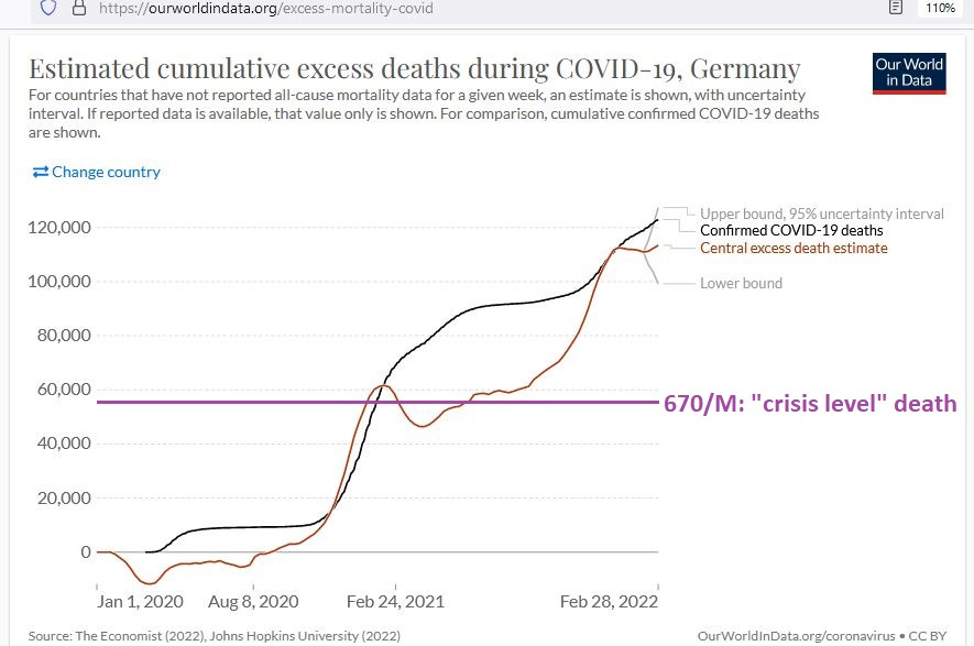
After vaccines had rolled out in Germany, there was a characteristic “S” curve in excess mortality (right at purple line), followed by a long and steep rise after vaccine coverage had expanded.
In Germany, as well as in Finland above, the accumulation of excess death after vaccines was more than twice what it was before vaccines. Said in a crude way, the combination of ‘vaccine + disease’ was more than twice as deadly as the disease itself.
Next up, is Gibraltar …
Gibraltar (pre-vaccine)

Gibraltar, apparently, did not have COVID for most of the year of 2020, as not even 10 total people had died of COVID even by January of 2021. Mortality was below what was expected for the entire year of 2020. It was still below expected when vaccines rolled out.
Gibraltar (post-vaccine)

Caution is required in interpreting the chart above, because any excess death points from 24 Feb 2021 and beyond are merely estimated, rather than measured or observed or recorded.
Because of beginning deep into negative excess death territory, the rise in excess death (which coincided with the introduction of vaccines) is actually equivalent to 3 “crisis levels” (3 times the total death associated with the pandemic “Asian Flu”).
Next up, is Greece …
Greece (pre-vaccine)

Greece had not reached crisis-level excess death before the vaccine rollout, though in the few weeks before the rollout — perhaps the most common theme here — the excess death was rising fast.
Greece (post-vaccine)

After vaccines rolled out in Greece, excess death went through the characteristic “S” curve before embarking on that same long, steep rise which coincides with increasing vaccine coverage of the population.
The accumulation of excess death after vaccine rollout was more than twice what it had been without vaccines.
Next up, is Hungary …
Hungary (pre-vaccine)
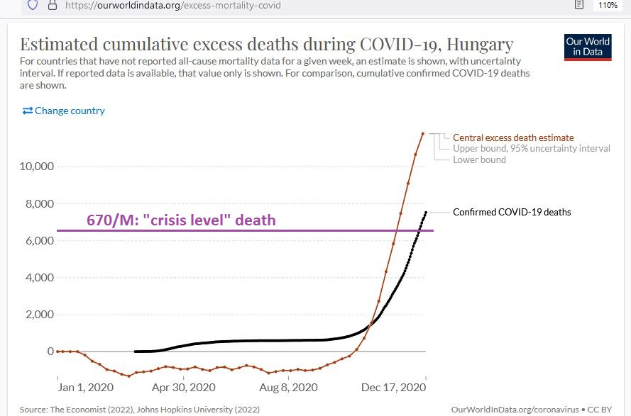
As commonly seen before, Hungary begins with that characteristic “lower-than-expected” mortality for the first few months of 2020. It also has that charactistic “last-few-weeks-before-vaccine” surge in excess deaths.
Accumulated excess death remained below zero for most of the year in Hungary, indicating that, for most of 2020 in Hungary, there was no COVID crisis.
Hungary (post-vaccine)
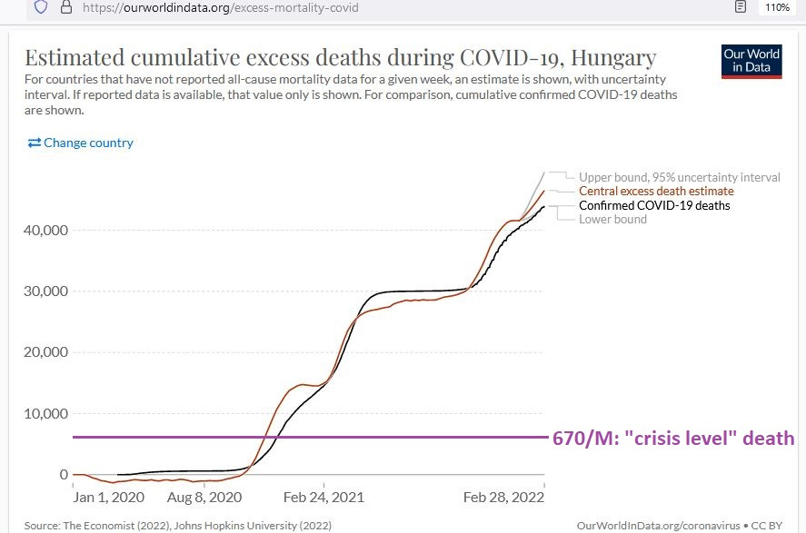
The sheer accumulation of excess death in Hungary after vaccines rolled out is mind-boggling and is equilavent to 4.6 “crisis levels” of excess death (4 pandemics worth of excess death).
The red and black lines track closely, meaning that the health authorities in Hungary have made the determination that the “quadruple-pandemic” post-vaccine deaths are all due to COVID.
But even looking at their low death numbers for most of 2020 calls that reasoning into question. Prior to November of 2020, COVID wasn’t causing much death there.
Next up, is Israel …
Israel (pre-vaccine)

By the time that vaccines rolled out in Israel (18 Dec 2020), Israel did not have a COVID crisis (excess death rate < 670/M). They were not even halfway there yet. But the trajectory of death at the time implied that they may be projected to reach crisis-level death.
They began the year in the common fashion: lower deaths than expected.
Israel (post-vaccine)

After vaccines rolled out in Israel, cumulative excess deaths embarked on an undulating rise with peaks and valleys which almost perfectly coincided with vaccine uptake. More vaccine uptake or administration = more excess death. Less vaccine uptake or administration = less excess death.
The accumulation of excess death after vaccines rolled out was almost twice as large as the accumulation of excess death prior to vaccines. By 14 Dec 2020, cumulative excess deaths were 2969. By 24 Jan 2022, cumulative excess deaths were 8668 — an additional 5699 from the day prior to the rollout.
Next up, is Japan …
Japan (pre-vaccine)

Japan had nothing even remotely resembling a COVID crisis by the day before vaccines rolled out. The accumulation of excess death was still strongly negative right up to the day before vaccines rolled out.
Japan (post-vaccine)
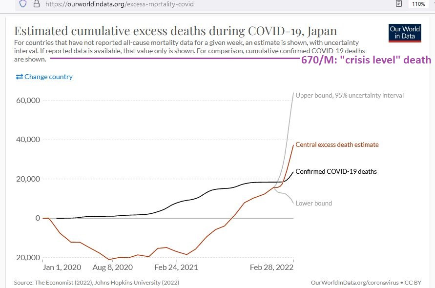
With no indication of any excess death before, after the vaccine rollout on 16 Feb 2021 in Japan, excess deaths began a long and steep climb, though they still remained below crisis-level, even up to February of 2022.
[end of Part 1]