

Anomalies in COVID Hospitalization Rates
Anomalies in COVID Hospitalization Rates
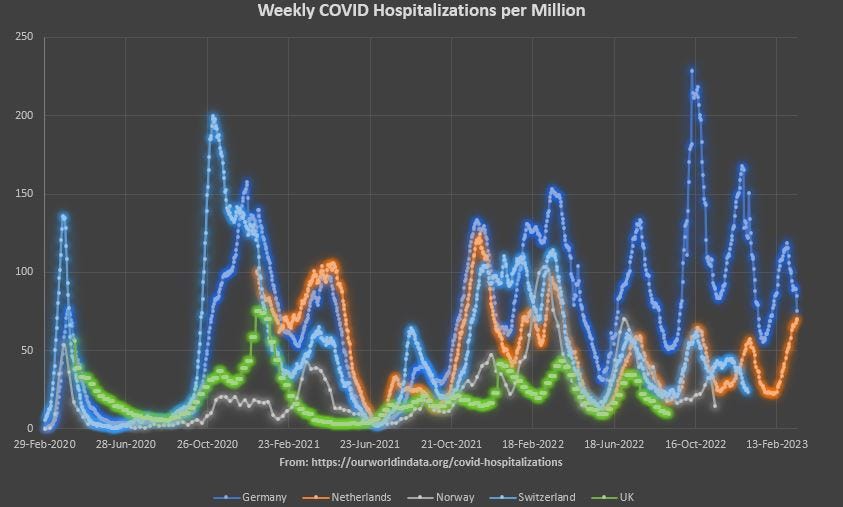
5-Nation Shootout

Here are the weekly COVID hospitalizations per million for 5 nations:
[click to enlarge]
Do you notice anything odd about this graph?
There were three things that stood out for me, beyond the possibly-innocuous detail that The Netherlands (orange) didn’t begin tracking COVID hospitalizations until they had already started to give out COVID injections.
But the other 4 nations tracked COVID hospitalizations for the full period of COVID, so we can use their experience before the jab and compare it to their experience after the COVID jab rolled out.
Here is the same graph, but with three oddities noted in it:
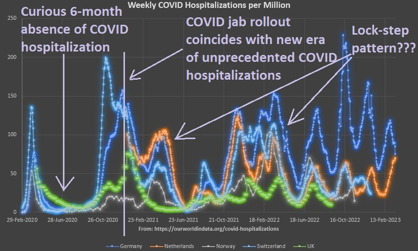
It’s difficult to believe that COVID hospitalization rates really did undulate up and down like this — essentially doubling or even tripling in a few weeks time, only to fall back again for a few more weeks, only to go back to doubling or tripling all over again over the next few weeks after that.
Flu doesn’t act like that.
Another oddity is that these transient and spurious rate doublings and triplings appeared to occur in a synchronized pattern. With 3 of the five nations rising tremendously for a few weeks, falling tremendously for the few weeks after, and rising tremendously in the few weeks following that.
It doesn’t fit with the history of hospitalizations by natural causes.