

COVID jabs led to more ICU admissions
COVID jabs led to more ICU admissions
15-region monthly comparison of 2020 vs. 2021

In an earlier Substack, I examined ICU admissions in 4 regions before and after COVID jab rollouts. The idea was to compare identical seasons of 2020 before jabs, and of 2021 after them.
An ideal range of months for yearly comparison runs from March to November.
But that sample was too small to reach statistical significance, so this Substack shows an extended analysis using 15 regions and a total of 96 individual head-to-head comparisons by region-month (e.g., ICU admissions in May 2020 in Spain versus ICU admissions in May 2021 in Spain).
Of the 96 head-to-head comparisons, 67 of them (70%) showed an increased ICU burden after COVID jabs rolled out — indicating that the COVID jabs increased the rate of severe hospitalizations. A chi-squared test on it was statistically-significant.
Here are 9 regions for the month of June in each year, 2020 (blue) versus 2021 (orange):
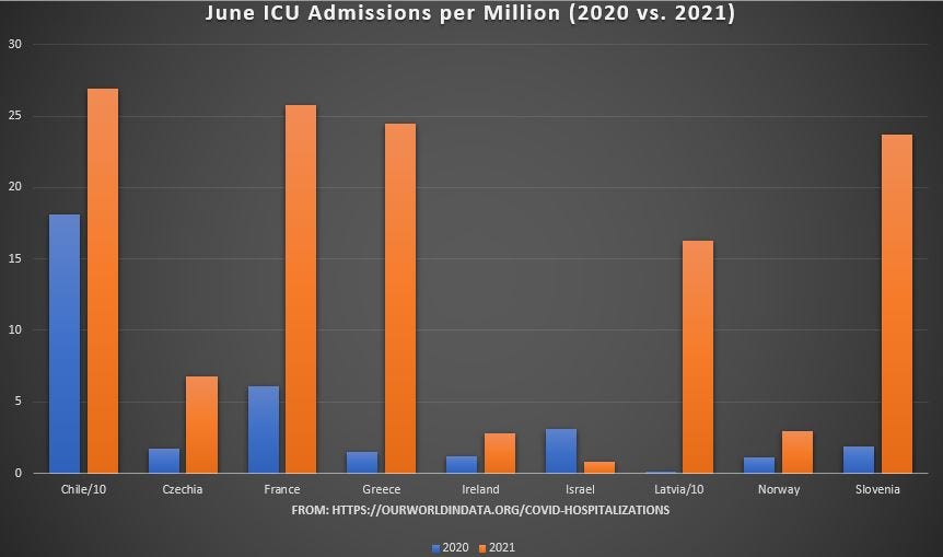
Note that Chile and Latvia had so much ICU admissions after COVID jabs that it was necessary to divide their values by 10 to keep them from skyrocketing off of the chart.
Also note how it is that Israel was the only region among the 9 to experience less ICU burden after COVID jabs rolled out. In over 85% of the regions with data available for June, COVID jabs led to higher ICU burden.
This is the opposite of what government officials claim. They claim that the jabs reduce severe hospitalization. Here are the notes as adapted from the data taken from the OurWorldInData page on Weekly new ICU Admissions for COVID-19 per Million:
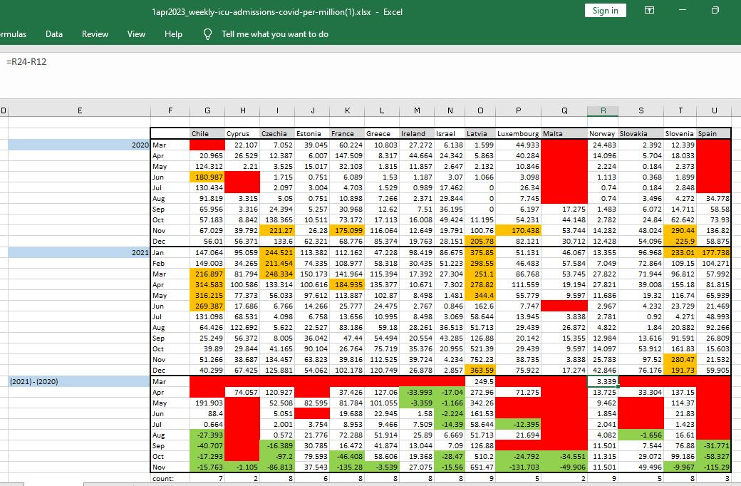
[click to enlarge]
Monthly sums of weekly ICU admissions per million show up at top, with questionably-high ones highlighted in gold. An arbitrary cutoff of 170 monthly ICU admissions per million was used in order to identify values which were questionable.
The bottom area shows the head-to-head comparison by region-month. Red areas at bottom indicate that at least one week of data was missing for the month in question.
The unshaded numbers at bottom are the months when ICU use increased after COVID jabs. The green-shaded cells indicate a month when ICU use fell after jabs.
There are more than twice as many region-months when ICU use worsened after COVID jabs than there were for when ICU improved. That result was statistically-significant in a chi-squared test (p-value < 0.0005).
So...what’s up with the outlier Israel? What does their success mean? Could it be spun that the jabs worked ‘cause Israel was the best jabber?