

Disturbing Timeline of Excess Mortality
Disturbing Timeline of Excess Mortality
Unexpected findings in at least 15 regions

=============
Note: This post does not dive into the depths of statistics like my other posts have done so far, but rather it presents a rough or crude visual effect from looking at specific regions where outstanding results were found. It serves as a first signal or as a warning bell, rather than as a final analysis. If evaluated on the standard of in-depth analysis, it would then fail to pass muster, and the criticism of “cherry-picking” the data would apply. But in-depth analysis is not the purpose of this particular post.
=============
Regarding COVID, there are 3 reasons that excess mortality is expected to fall over time:
1) a “pruning effect” where the most frail will die only very early on (and then this largest expected death rate increase would almost completely disappear from data)
2) mutation of the virus toward less-lethal variants is expected (within a single year)
3) high vaccine coverage would be expected to dramatically cut the mortality rates
=============
Note: The 3 big reasons above, for excess mortality to drop over time, are not the only 3 ways for it to drop over time, and an additional reason for excess mortality to drop would be improvements in treatments or therapeutics. These 3 were chosen because they are automatically “baked into” the worldwide COVID experience. They are true of all nations, and can therefore be expected to always be working in the background to lower excess mortality over time. In contrast, it is not true of all nations that good COVID treatments were widely used.
=============
But evidence from at least 15 regions around the world shows that one of the 3 key reasons is contradicted by the evidence.
Either there was (1) no big pruning effect from the most susceptible subgroups of the population (i.e, elderly, frail, low-immunity) dying early, and in large numbers, or there was (2) no substantial mutation of the virus into variants that were less-lethal, or there was (3) harm from taking vaccines.
Two of the reasons would still be expected to be working in the background, continuing their individuals effects on bringing down excess mortality over time. But if the third effect was so strong that it could overcome the effects of the others, you might even see excess mortality rise.
Here are 15 regions where excess mortality before vaccine never reached 10%, and was often even below 0%, but then excess mortality rose higher after vaccines rolled out. For perspective, imagine a horizontal line at 22% excess mortality — i.e., the average annual accumulation of excess mortality during each of the 4.5 years of World War I.
Two regions below accumulated more excess mortality than is even found during a world war. Even worse, almost all of it was accumulated AFTER their vaccine rollouts.
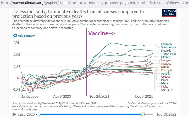
These regions cover a relatively wide area, though regions in Eastern Europe seem to be more common.
Here is a breakdown of accumulated excess mortality per 100,000 in 6 selected regions, showing that there was never a time during the year of 2020 (left side of purple line) when 200 excess deaths per 100,000 were found — but in most cases even up to and beyond 400 excess deaths per 100,000 had accumulated after vaccines rolled out:

And here is an age breakdown in 3 selected regions (presented alphabetically), starting with Hungary:

Notice how even the working-age population (top-middle) in Hungary had high death after vaccines rolled out — even over 100% — though it never had even 50% excess mortality in the year of 2020, as found on the left side of the purple line.
Let’s look at Latvia now.
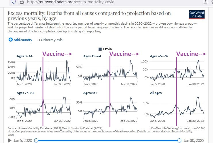
In Latvia, the working-age population stayed well below 50% excess mortality in the year of 2020, but approached 100% excess mortality only after vaccines rolled out. The older age groups also saw their highest excess death rates with vaccines (compared to without them), and the age 65 to 74 group saw over 100% excess mortality with vaccines.
Then we have Slovakia:
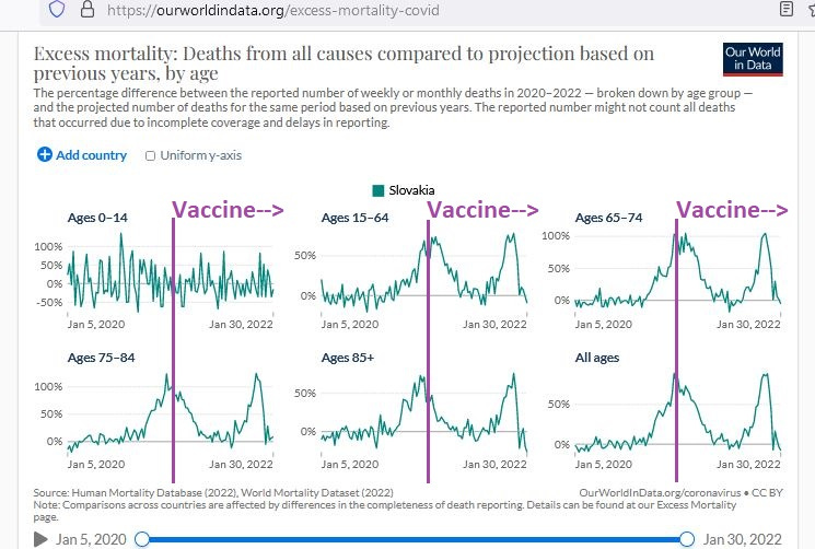
Slovakia also shows very high excess death rates after vaccines rolled out, exceeding 100% excess death in those from ages 65 to 74 and also in those from ages 75 to 84.
And here is a 13-region accumulation of excess death per milliion:

This graph shows the accumulated excess deaths per million people, and in no case ever reaching 1000 excess deaths per million during the year of 2020 — though in some cases approaching 4000 excess deaths per million after vaccines rolled out.
For perspective, the average annual excess death for the 4.5 years of WWI was 3800 per million, showing once again that at least 2 regions in the chart above — after vaccines rolled out — developed excess death rates exceeding even those found during world war.
This “rough & ready” outline of a safety signal serves as an early warning alarm bell. If alarm bells do not go off in your head from the graphs above, then that’d be a big surprise.
Things like “mortality quadruplings” should present a red flag to most reasonable people — especially against the backdrop of an expected fall of excess mortality over time.
There is definitely a safety signal here.
Reference
[The World War I excess death rate was 22% yearly, or 3800 per million yearly] From: https://www.census.gov/history/pdf/reperes112018.pdf
[Charts from OWID, Our World In Data] From: https://ourworldindata.org/excess-mortality-covid