


Follow-up to the Follow-up of "Boosters appear Deadly"
Uncanny correlation

This Substack is a follow-up to a previous follow-up, where eery similarity was found between weekly booster jab rates and weekly excess deaths in the USA. I used a forward-looking analysis of excess death by stepping them backward by 16 weeks, so as to compare them to the jab rates which had been seen 16 weeks prior:
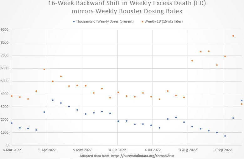
This tracking of weekly excess death to weekly jab rates 16 weeks prior is uncanny. It suggests that there should be a full-pause on COVID booster shots — as it is presumed here that the vast majority of all doses after February of 2022 were booster doses.
Here are steps to reproduce the graph by using data of a graph at this link: https://ourworldindata.org/mortality-risk-covid
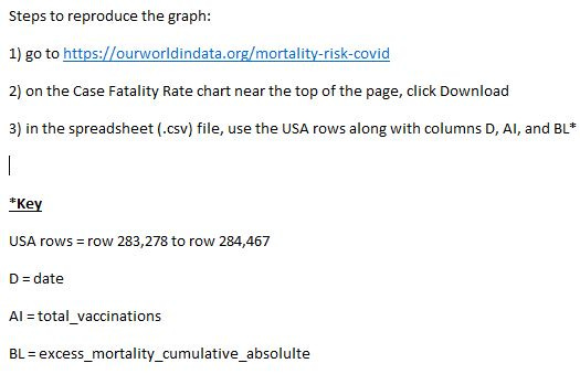
Technical note: To make total_vaccinations into a list of just the totals on that day of the week when total excess deaths get reported, use Excel’s Weekday function on the dates (the first date involved in chart above is 6 mar 2022) in order to create an adjacent column with the “day-of-the-week” number in it — which can be sorted
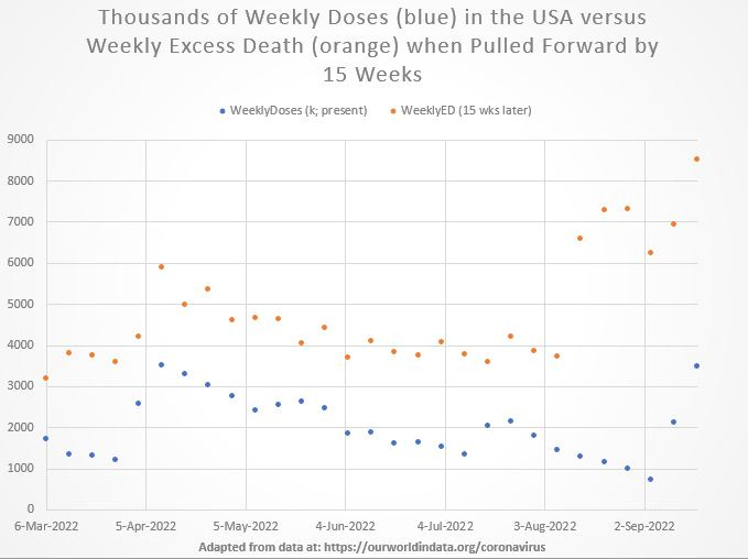
p.s., I noticed that a 15-week lag was needed instead of 16 weeks. Here is that graph:
Well, if that was done correctly then you really managed to tease the implications out of that data with such clarity that it's only a matter of time before people start the personal attacks. Well done, I think. Well done.
Maybe it just takes awhile for the initial shot to kill you. :)