Some of those who are “on the good side” appear to have become snookered by the wily antics of collectivists who — just like in Orwell’s 1984 — set things up so that your use of language backfires. By continuing to refer to economies suffering under heavy government interventionism as “free market economies” then progress is stifled.
We absolutely have to agree on a common ground and on objective definitions. There can be no exceptions — no wrong use of right terms — allowed. This means telling it like it is, even if it personally harms you, or your ambitions for wealth or power. Okay, as promised, here are two charts to cement in the fact of gutting out the Middle Class:
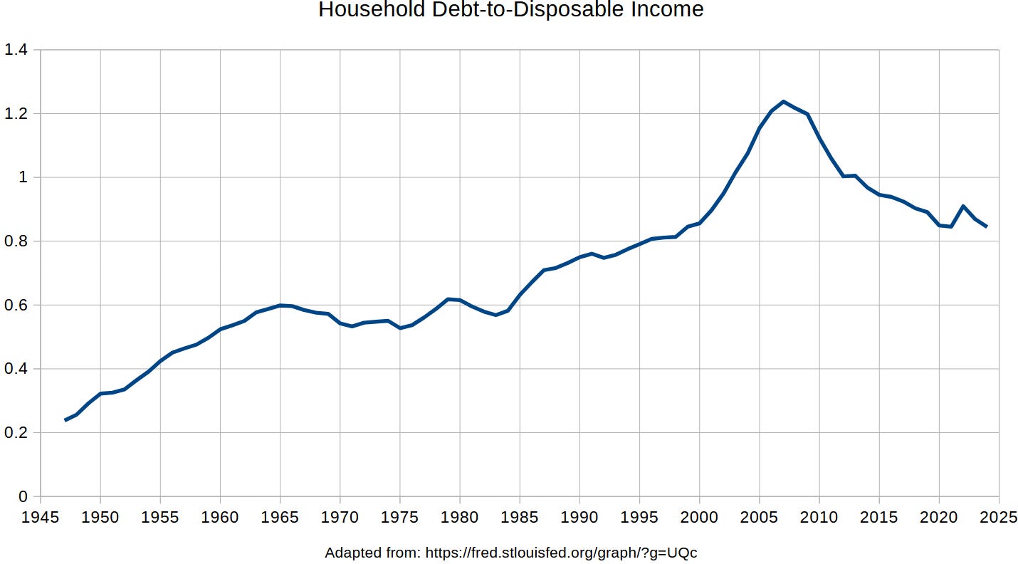
Average Household Debt Leverage (debt-to-disposable-income)
On its own, this chart does not prove anything about whether the Middle Class has been hammered. It merely says that the average value of a very important measure of economic health has worsened over time. At far left, the rise can be explained by the invention of credit cards and the move to a modern economy with credit instruments.
Then, by 1965, you reach a steady-state situation. Everyone has their credit cards and the average household debt-to-income is a stable 60% — for the next 20 years or so. Then, some really bad things start happening and debt leverage begins to rise. By the year 2000, some really, REALLY bad things start happening (steepest-ever rise).
While this chart shows “the whole boat sinking,” we can ask a follow-up question:
Do those in the Middle Class have equal access to the lifeboats?
Another way to put this has to do with the share of the burdens. Household debt, on average, went up — but did it go up in roughly equal proportion from a baseline? Against this background of rising average debt, let’s now look at the differential change in debt by particular income strata from a baseline in 1980:
The evolution of debt by income level
The top black line shows the evolution in debt for those in the bottom 90% using 1980 levels as a standard baseline. It began rising shortly after 1980, and really kicked in by about the year 2000. The middle green line is the 90th percentile up to the 99th percentile, experiencing only a modest rise in debt. Purple at bottom is the top 1%.
Let’s recap. While the entire nation has been drowning in debt more and more, the top 1% has been unloading debt and, instead, becoming a net borrower to the rest of the income distribution. If a recession is caused by the Federal Reserve juicing the markets with below-natural interest rates, the rich will bail out the poor: with lucrative loans.
Lather, rinse, and the cycle repeats. With each cheap-credit-fueled recession, the rich grow richer — like a rachet that only notches up in one direction — and the poor become more and more in debt. If the average debt keeps getting worse, but the top 1% keeps getting into a better position while the boat sinks, then we’re being hammered.
Reference
[household debt leverage broke away from its steady-state value of 60% of income] — Adapted from: https://fred.stlouisfed.org/graph/?g=UQc
[above-natural savings by the rich grows the debt of the poor] — https://projects.iq.harvard.edu/sites/projects.iq.harvard.edu/files/peif/files/mss_richsavingglut.pdf


