

Magical Elixir Effect, Part 3
Magical Elixir Effect, Part 3
Astonishing death data from the UK

This is part 3 of the Magical Elixir series, showing that UK death data make it seem as if they discovered a Magical Elixir, but didn’t tell the world about it. A rough guess as to what death rate is expected at what age in the UK comes from the 2016 value (far right of lines) in this source:
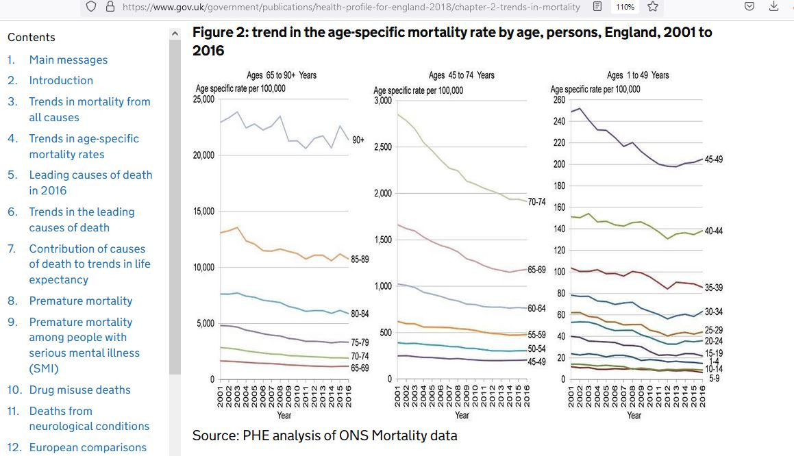
As is shown, the expected yearly death rate of 40-44 year-olds is about 139 per 100,000, while the expected yearly death rate of 45-49 year-olds is about 205 per 100,000.
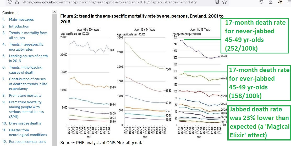
If the overall age-specific death rates from Jan 2021 to May 2022 were superimposed on the graph, you’d be able to compare observations with expectations. But the recorded death in those of age 45-49 who were “ever jabbed” was 23% lower than expected (Magical Elixir effect), while the “never jabbed” were 23% higher:
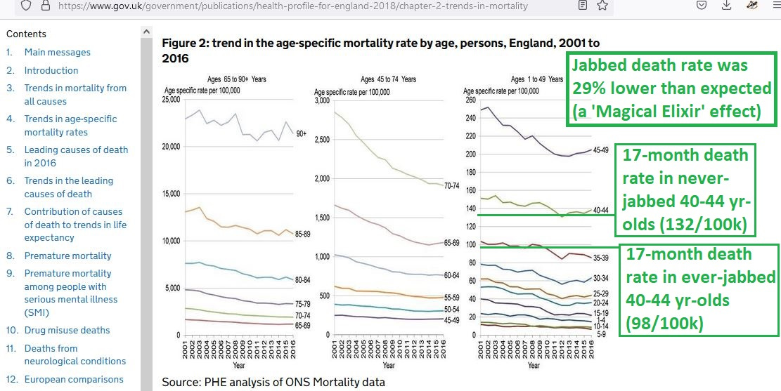
There is an even greater “Elixir effect” for those aged 40-44:
Who can explain this?
Reference
[age-specific UK death rates] — Health Profile for England. Chapter 2: trends in mortality. Published 11 September 2018. https://www.gov.uk/government/publications/health-profile-for-england-2018/chapter-2-trends-in-mortality
[National death data in the UK] — Office for National Statistics. Table 6. https://www.ons.gov.uk/peoplepopulationandcommunity/birthsdeathsandmarriages/deaths/datasets/deathsbyvaccinationstatusengland
Note for the above: To convert the tabulated data in Table 6 to a death rate, divide column F (all cause deaths) by column C (person-years), itself divided by 100,000 — like this:
[F]/([C]/100000)You will then have the total number of deaths over the total number of “hundreds of thousands of person-years”