

More Evidence that Climate Theory is False
More Evidence that Climate Theory is False
Re-analysis of published research

The Important Thing
The important thing to be concerned about with regard to Climate Change is whether the Greenhouse Gas Layer (GGL) heats up. Carbon dioxide emissions can end up in the mid-troposphere, about 3 to 6 miles above the surface of the earth.
If too much gas builds up there, then too much radiated heat gets trapped there, and eventually that heat is redirected to the surface of the earth, warming up the surface. It’s the same thing that happens when the glass ceiling of a greenhouse traps heat.
Thankfully, 24 years of measurements of the temperature change at altitude reveal that we are “in the clear” and that the troposphere isn’t warming fast enough to cause a lot of surface warming (i.e., the Greenhouse Gas Effect, GGE).
You wouldn’t know that the measurements are not rising fast enough in order to be of any great concern to us, if you only ever listen to the pundits. Pundits typically tell you that the earth is about to go off the deep end.
Ever notice how they never talk about the temperature of the greenhouse gas layer though?
It’s ironic that the central idea behind all of the hullabaloo never gets talked about.
That’s like never mentioning the infection fatality rate for a disease, but just trying to scare people anyway. How bad is the disease, Mr. Expert?
“It’s really bad. It’s really, really bad.”
But do you have measurements showing how bad it is?
[frantic hand-waving; stuttering] “It’s REALLY bad! Can’t you just take my word for it?”
When climate scientists measured how bad it was, they found out that it isn’t so bad. You can be mad at them for going decades before measuring how bad it was, with pundits scare-mongering us the whole time, but you can also give them credit for finally getting around to it.
What they found
When Thorne et al., 2011 measured the temperature trend in the tropical troposphere in order to be able to compare it to the expected trend that Greenhouse Gas Effect theory (GGET) predicts, they discovered that from 1979 to 2003, the greenhouse effect was not a major concern.
The Conclusion/Discussion section of their study still makes the case for concern though, but the data from 1979 to 2003 say otherwise. Here is a mock-up of one of the graphs in the study (cited in references below), showing how you can tell whether climate theory has been falsified by the evidence:
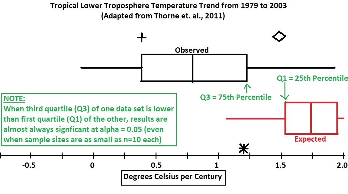
The large red and black shapes are modified boxplots, and the quartiles are labelled in this rough depiction of the left side of Figure 12 in the study (the period from 1979 to 2003). The asterisk at bottom right represents the surface warming, used along with an amplification factor to reveal the red boxplot at bottom right.
In the tropics, surface temperature rises 1 degree C for every 1.4 degrees C that the troposphere (greenhouse ceiling) does. To get the surface to rise by a degree, you must increase the temperature in the greenhouse gas layer by 1.4 degrees.
The green note at bottom left reveals that the boxplot evidence is already statistically significant, because the third quartile of observed tropospheric warming is below the first quartile of expected tropospheric warming.
Here are two simulations using distributions about as different as you can possibly get: Standard Normal Z distribution and also the Uniform distribution, where the sampling from the uniform distribution used endpoints from 0 to 9:
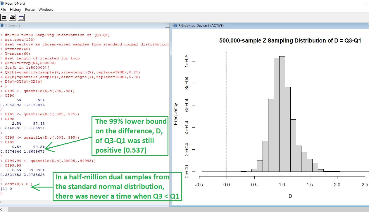
With half of a million dual-samples (a million total samples) from the standard normal distribution, it was NEVER the case that the 75th percentile of one sample was lower than the 25th percentile of a second sample.
But critics and detractors may complain that it cannot be assumed that the temperature trends follow a normal distribution. To preemptively address that criticism, here is the simulation from a uniform distribution, which is about as far away from normal as you can get:
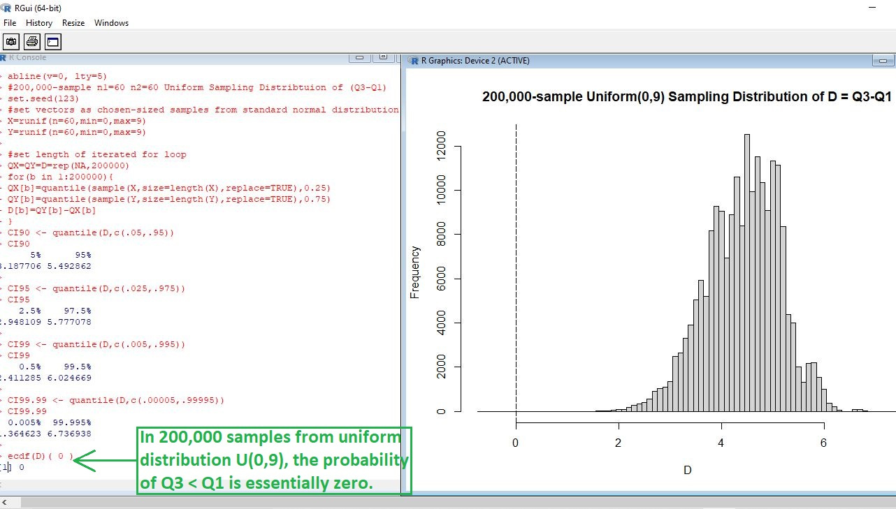
In this simulation, there was equal probability of ANY value between 0 and 9 in each sample. A few examples might be 0.000011, 5.732641, and 8.999993 — all showing up in the sample with equal probability, rather than like in a normal distribution where the mean is most probable.
In the frequency histogram at right you can see the probability drop off well before the difference of quartiles approaches zero (where Q3 of one sample equalled Q1 of the other).
Just like with the normal distribution, it was never the case that Q3 < Q1.
The hypothesis that the greenhouse gas effect is responsible for the bulk of recent warming would be falsified at alpha = 0.05. If samples leading to the boxplots were large, it would even be falsified at alpha = 0.005 (corresponding to the lower bound of a 99% confidence interval around the difference of quartiles).
That’s even at a signficance level which is 10 times lower than the conventional (0.05) one that is used.
What it means
It’s good to know, from careful analysis, that there are not even 5 chances in a thousand that climate theory is true and that we are headed for catastrophe — given the tiny probability associated with the boxplot findings.
The median of the observed data (vertical bar inside black box) didn’t even make it up to the 5th percentile of the expected data (left edge of left whisker), further confirming that the GGE was not actually behind the bulk of recent warming — as IPCC scientists have been so fond of saying.
The way that the issue was handled in the study was to show how uncertain things are, making them so uncertain that every expectation is covered. But, in doing so, they inadvertently make error bars so far away that the data become consistent with actual cooling in the troposphere!
Taking them at their word that the uncertainty is THAT large, and that we essentially have no robust knowledge about the temperature trend — i.e., robust knowledge requires error bounds that don’t cross zero — then any efforts to address climate change become only speculative (at best).
If data are consistent with cooling of the troposphere (that one thing which matters to climate theory, yet never gets talked about), then taking no action is every bit as reasonable — and very likely more reasonable — than actually fighting “climate change.”
Here is a quote:
“Over 1979–2003, the satellite-equivalent tropical lower tropospheric temperature trend has likely (5–95% confidence range) been between −0.01 K/decade and 0.19 K/decade (0.05–0.23 K/decade over 1958–2003) with a best estimate of 0.08 K/decade (0.14 K/decade).”
And an interpretation:
There is at least a 5% chance that the greenhouse gas layer has been cooling by -0.01 degrees Kelvin per decade (-0.1 degrees per century) from 1979 to 2003. And, if that layer has cooled, it means that NONE of the recent warming has been from a GGE.
It’s physically impossible for a body (greenhouse gas layer) to progressively heat up another body (earth surface) at a sustained rate — i.e., for decades — while becoming cooler the whole time that the other body is getting warmer. Any cooling of the first body, coupled with heating of the second, MUST reduce the rate of heat transfer (making it “self-limiting”).
Reference
[uncertainty in warming trends at altitude (greenhouse gas layer)] — A quantification of uncertainties in historical tropical tropospheric temperature trends from radiosondes. First published: 29 June 2011. https://doi.org/10.1029/2010JD015487. Also: https://agupubs.onlinelibrary.wiley.com/doi/full/10.1029/2010JD015487