

New York City Pestilence

The Department of Health for New York City put out a graphic showing how they’ve made progress in a “Conquest of Pestilence” — though it is unclear why the World Trade Center Disaster is included at bottom right.
What pestilence was “removed” on 11 Sep 2001?

With a little sleuthing, I obtained “kill rates” for all of the years and all of the diseases in this graphic. The worst-ever epidemic of New York City occurred in 1849, a cholera outbreak that individually (single-handedly) killed off people at a rate of 1,024 per 100,000.
This unprecedented disease kill rate is found in cell E14 in the spreadsheet below. For perspective on that number, the overall crude death rate of the world, from all causes put together, was under 800 per 100,000 in the year of 2019.
Here are the notes:
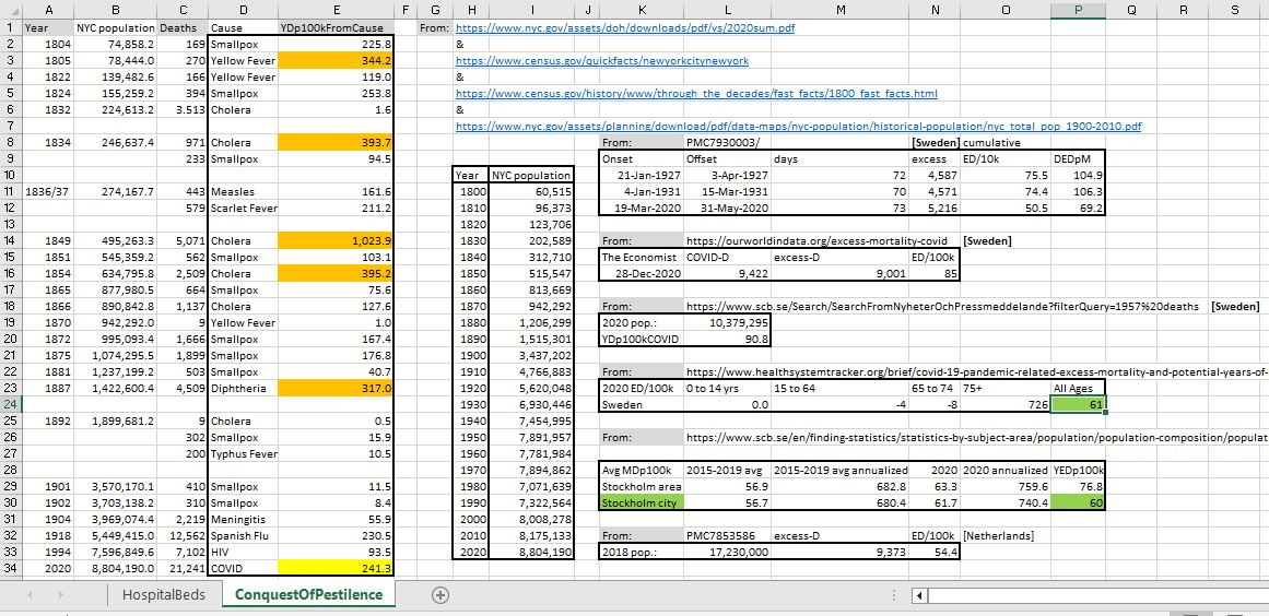
[click to enlarge]
The New York City COVID death rate for 2020 (cell E34) was 241.3 per 100,000 — an appalling number when compared to the city of Stockholm in Sweden, with an excess death rate (cell P30) of just 60 per 100,000.
The 4-fold differential between this “Tale of Two Cities” suggests that 3 of every 4 COVID deaths in New York City were avoidable, if only correct public health policies had been followed — as was done, for the most part, in Sweden.
It’s amazing that awards had been given to magistrates in New York City for the COVID response, given how they literally did 4 times worse than a city which never locked down.
It was about fear and control. New York gave them the headlines they needed to create fear and control. Death was needed to enact their controlling policies. That’s why remdesivir was the only approved drug for treatment in hospitals at the beginning of the pandemic; it insured that there would be enough deaths attributed to covid-19 to scare and control the masses, and since hospitals who used it were indemnified, the patients and their families were the only ones harmed.