
Prior 6 Months of Dosing Tied to Excess Death
Post #493

In this prior substack essay, I compared Japan to Italy, two nations with elderly populations. Japan’s persistently-high jab uptake led to 10 times the excess death which had been found in Italy. This is a follow-up with more nations.
This first attempt to correlate recent jab uptake to excess death levels failed to reach statistical significance at the 1% level, but it did reach statistical significance at the 5% level: more jabs ==> more excess death:
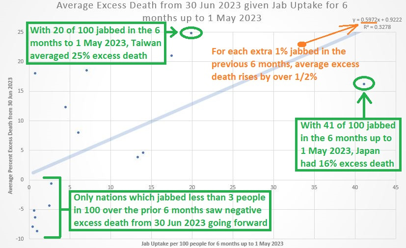
The regression equation at top right indicates that, for each extra 1% who get jabbed 6 months prior, ongoing excess death averages to at least a half-percent higher. For every 2% who took the jab in the 6 months prior, excess death is expected to rise by over 1%.
At bottom left is a note showing how the only way to see negative excess death in these data was if only very few took the jab. The comparison between Taiwan and Japan is intriguing, and one likely explanation for the difference is that Taiwan has a younger population.
The jabs appear to have the worst effect on the young, shortening their lives more. Japan’s persisting excess death reveals that even when given to older people, jabs are counter-productive from the perspective of all-cause mortality.
Evidence suggests that COVID jabs kill people.
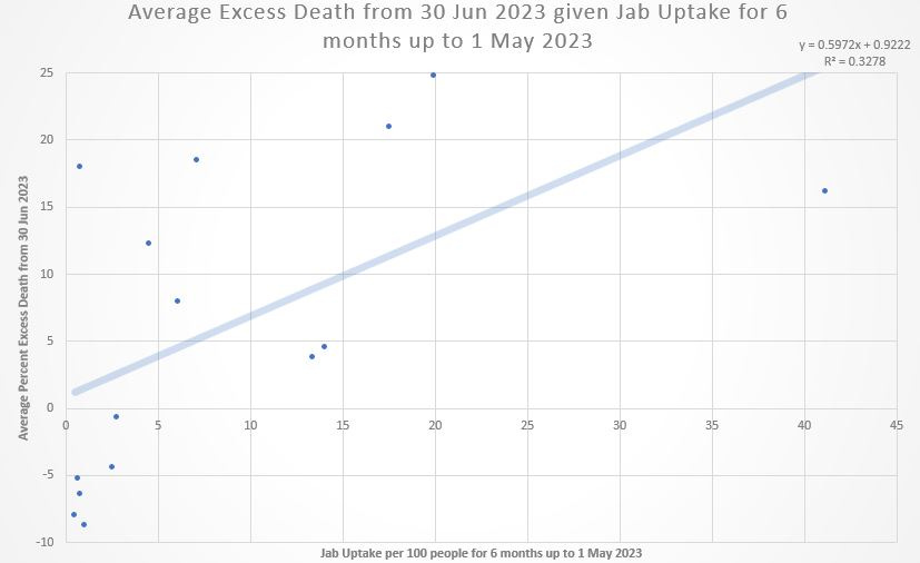
Here is the same graph without notes in it:
Note how it is at very bottom left that, if no jabs are taken, little-to-no excess death is expected (the Y-intercept).
If Japan were to be removed as an outlier, the regression line would become even more steep, indicating even more excess death from having more of the people getting jabbed in the prior 6 months. The relationship would approach a 1:1 ratio (i.e., for each 1% jabbed in the prior 6 months, an extra 1% of excess death is expected going forward).
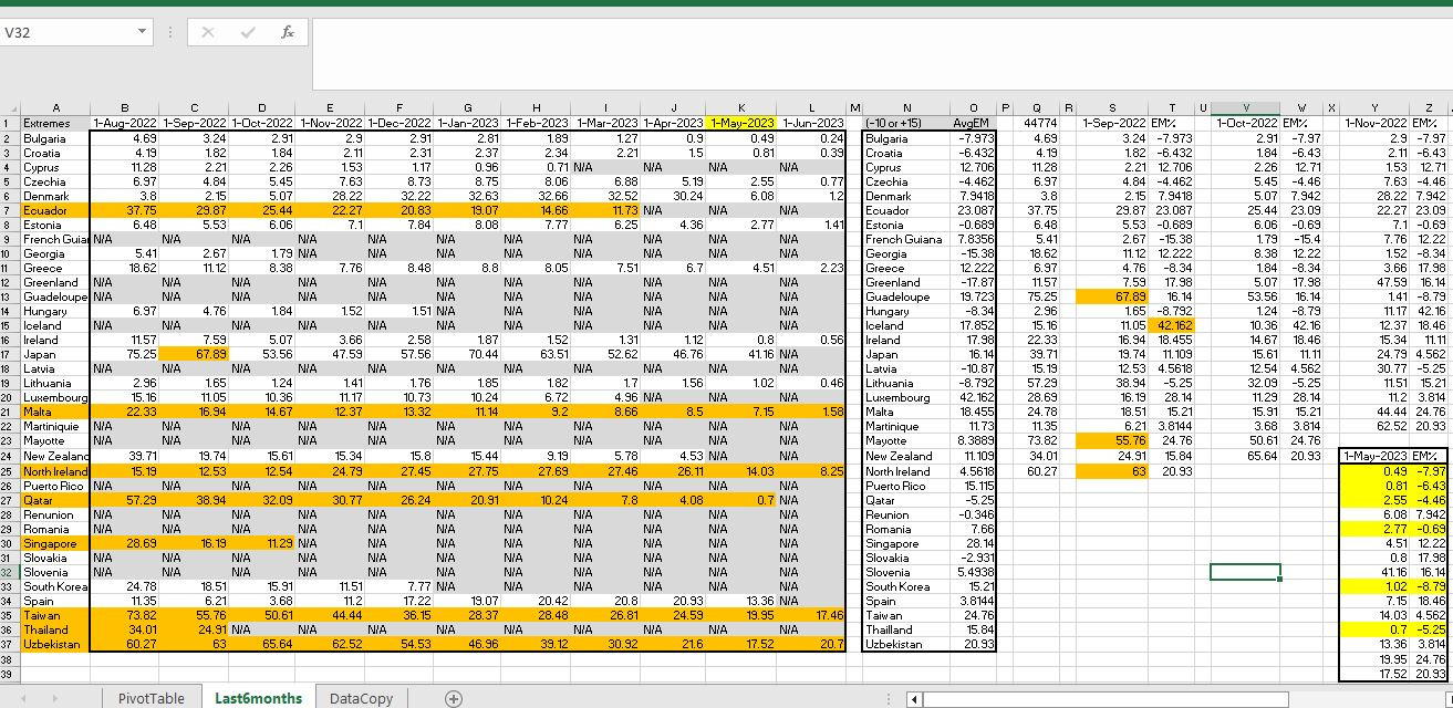
And here is the spreadsheet used in order to create the graphs (click to enlarge):
How this report was created:
The selection criteria for creating the sample was an extreme mortality on or after 30 Jun 2023, using cutoff points of -10% excess death and +15% excess death in any time period from 30 Jun 2023 going forward. This created a pool of 36 nations which were then checked for jab uptake in the 6 months prior to the first of each month.
The sparse availability of the jab numbers for 6 months up to 1 May 2023 (many nations stopped reporting) restricted the sample down to the 15 nations shown at very bottom right in the spreadsheet.
From those 15 nations, a scatterplot and regression line was formed using the jab uptake found in Column K as the explanatory variable (X) and the average percentage excess death found in Column O as the response variable (Y).
Percentage excess death was determined using 2015-2019 as the baseline. Relaxing the selection criteria — such as by taking any single 10% deviation from expected mortality — would have enlarged the mortality pool for the sample and possibly would have led to statistical significance even at the 1% level.
Reference
[OurWorldInData Coronavirus page] — OWID. https://ourworldindata.org/coronavirus
I would encourage you to run some other versions of this model usung various relaxations if the exclusion criteria. Thanks so much for the good work.