

Revised "Masks can possibly kill you" Substack
Revised "Masks can possibly kill you" Substack
Error found and corrected

In a recent Substack, I made an error in data analysis and have corrected it here along with streamlining the data window so that it only includes “COVID weeks” (weeks after February of 2020).
Here is the updated graph showing the mean weekly percent excess death among nations that were consistently-low mask users (blue bar at left) versus nations that were consistently-high mask users (orange bar at right):
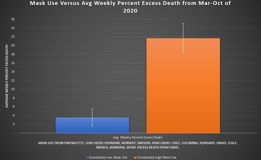
[click on image to enlarge it]
The main difference from the previous analysis is that the group at left with low use of masks has a mean that is somewhat higher now, but the 95% error bars indicate that high mask use still led to a statistically-significant increase in weekly excess death when compared to low mask use (more masks —> more excess death).
The increase in excess death which was seen with high use of masks was 6-fold.
Here are the updated notes, where yellow cells indicate only monthly excess (not used here) and the orange cells indicate no excess death data in the series used, and the new time-window was 36 weeks:

[click on image to enlarge it]