

Zany Death in UK among the 40-49 year-olds
Zany Death in UK among the 40-49 year-olds
Superimposed on top of rate "ever-jabbed"

Note: This graph has an error that I will fix later, and I blame UK government officials who make it hard to do research — such as by mislabeling a year as if it is a day in Excel (so that functions will no longer work on it).
The percentage of people who have ever taken a jab can be found from the percentage of people who never did. Using UK ONS data, you can superimpose the yearly death rate by month on top of the percentage who have ever taken a jab.
If the jab percentage rises by a lot, it means people have become newly jabbed (first-time jabbed). Here is the chart without notes:
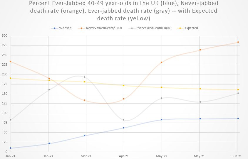
The yellow expected death rate line involves the most assumptions, because it uses age-specific England & Wales death rates from 2015, along with a seasonality index that applies to Canada (it’s the best I could get on short notice).
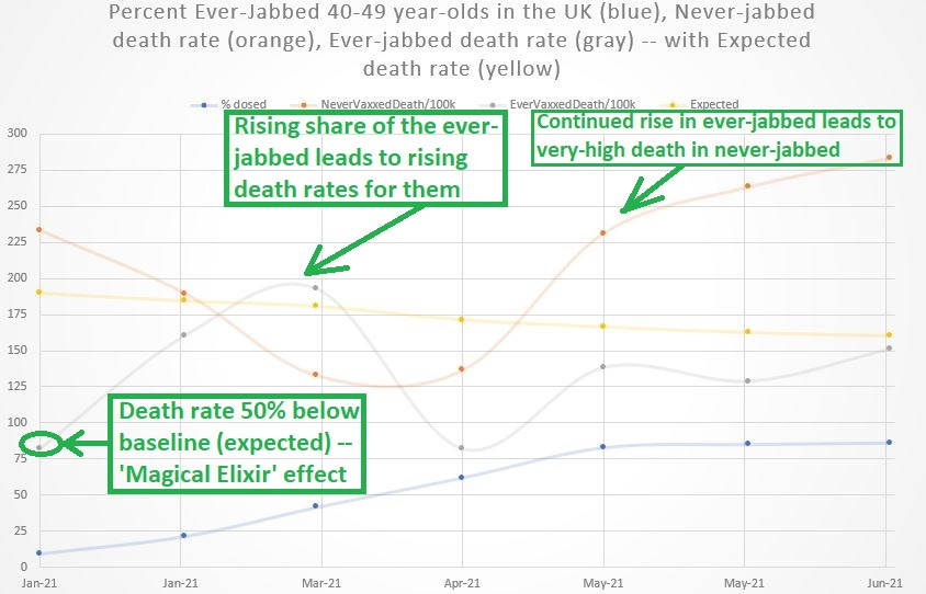
But the big news is that an increasing share of those ever taking a jab led to a higher death rate for them — after they started off at an “impossible” death rate of 82 yearly deaths per 100,000 in January when 190 deaths per 100,000 was expected for them.
That 50% reduction in baseline (expected) death is called the ‘Magical Elixir’ effect — because there is no rational or medical reason for people to die at half the rate they were expected to.
No drug or treatment known to man cuts natural death rates by 50%.
Here’s the graph with notes in it:
Note: This graph has an error that I will fix later, and I blame UK government officials who make it hard to do research — such as by mislabeling a year as if it is a day in Excel (so that functions will no longer work on it).
Reference
[Share of age-groups which were jabbed over time] — Dataset. Coronavirus and vaccination rates in people aged 18 years and over by socio-demographic characteristic, region and local authority, England. https://www.ons.gov.uk/peoplepopulationandcommunity/healthandsocialcare/healthinequalities/datasets/coronavirusandvaccinationratesinpeopleaged18yearsandoverbysociodemographiccharacteristicandregionengland
[age-specific death rates from 2015] — OWID. https://ourworldindata.org/grapher/death-rate-by-age-group-in-england-and-wales
[adjusting average yearly death by a seasonal index, to get month-specific death rates] — Falagas ME, Karageorgopoulos DE, Moraitis LI, Vouloumanou EK, Roussos N, Peppas G, Rafailidis PI. Seasonality of mortality: the September phenomenon in Mediterranean countries. CMAJ. 2009 Oct 13;181(8):484-6. doi: 10.1503/cmaj.090694. Epub 2009 Sep 21. PMID: 19770237; PMCID: PMC2761439. https://www.ncbi.nlm.nih.gov/pmc/articles/PMC2761439/
[17-months of national death data in the UK: Jan 2021 to May 2022] — Office for National Statistics. Table 2. https://www.ons.gov.uk/peoplepopulationandcommunity/birthsdeathsandmarriages/deaths/datasets/deathsbyvaccinationstatusengland