

More on COVID Fatality Rate of Seniors
More on COVID Fatality Rate of Seniors
Post #485

Steve Kirsch reported again about the COVID fatality rate in U.S. Nursing Homes. An update of my first corroboration of Steve’s findings is in order.
The first graphs I made had used cases with the subsequent deaths pulled forward by one week, but a more salient visual would leave the deaths inside of the week that they occurred, pushing the cases backward by a week, instead.
Here are the weekly COVID fatality rates for long-term care (LTC) residents:
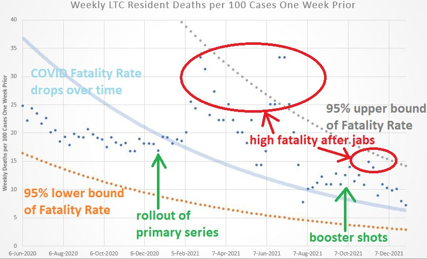
In this improved graphic, the high COVID fatality rate at some time “after” booster shots is easier to verify (in the original, the deaths were graphed right on top of the booster rollout, so that it wasn’t clear that higher fatality followed the booster shots).
Here’s the same graph without the notes in it:

It’s very clear that COVID fatality rates in U.S. nursing homes rose after jab rollouts.
The last few weeks depicted at bottom right show the COVID fatality rate dropping as the Omicron variant was displacing the Delta variant — after a brief spike in fatality rates which followed the rollout of booster shots.
And here is an image of the spreadsheet used in order to produce these graphs:
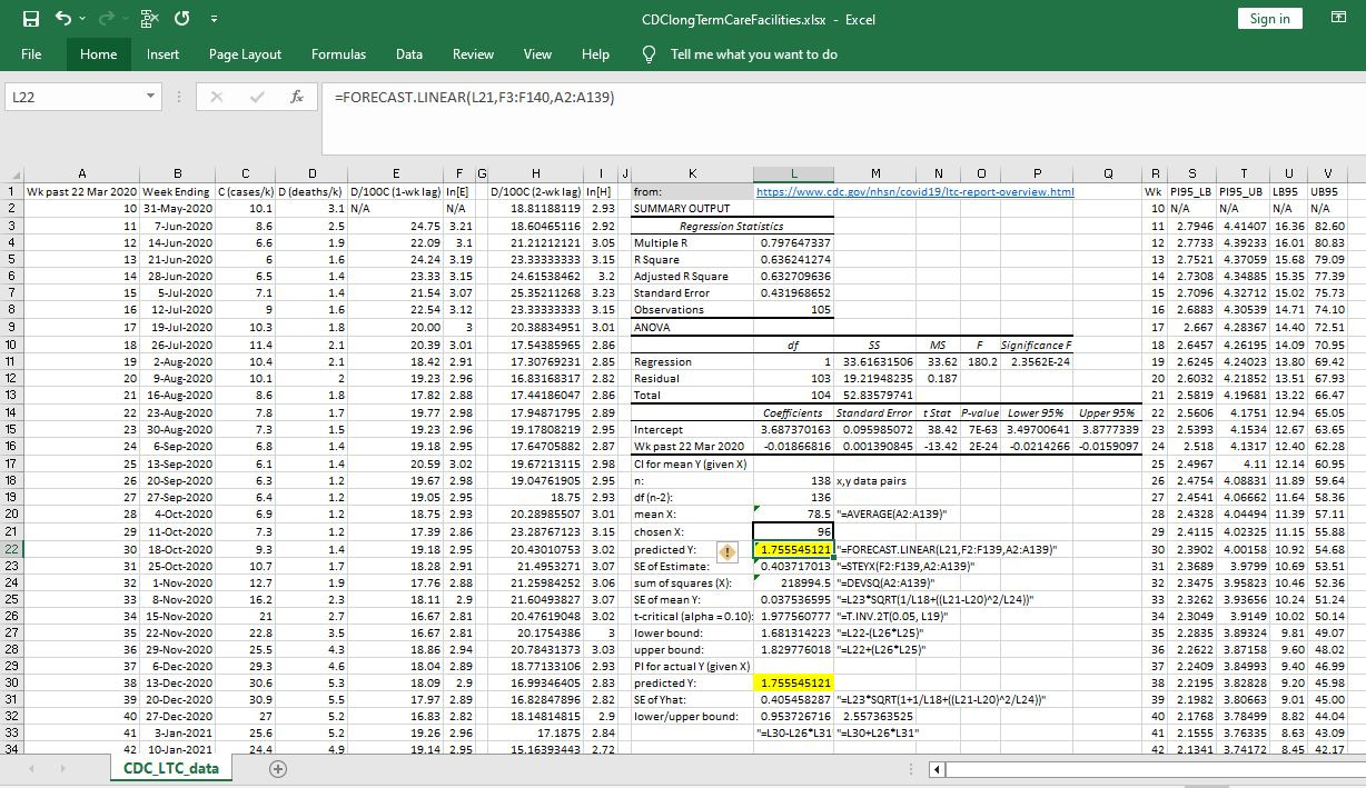
Columns C and D (the “raw data”) are the weekly case rates per thousand and death rates per thousand — and they come directly from the CDC Dashboard linked to below. Column E is the one-week lagged COVID fatality rate, and column F is the natural log of it.
The formula in cell L22 shows up at top, with a linear-model time-series of the natural log of the COVID fatality rate. Directly above that cell, it shows that a prediction for Week 96 of the pandemic was being made — where Week 0 would be listed as beginning on 15 Mar 2020.
Each week’s upper and lower bound fatality rates are listed in columns U and V. Using this labeling system, CDC data began on Week 10 of the pandemic (the week ending on 31 May 2020).
Reference
[weekly cases and deaths in long-term care facilities] — CDC. Nursing Home Covid-19 Data Dashboard. https://www.cdc.gov/nhsn/covid19/ltc-report-overview.html