
More Zany Deaths
50-59 year-olds in the UK during rollout

Note: For cited sources, visit the link given in the first sentence below and scroll down to References.
In what can be called a Zany Death series, I first looked at those from age 40-49 in the UK. Findings were disturbing, because increasing jab coverage led to big increases in death rates — though it appears that getting jabbed causes someone else in your age group who was NOT jabbed to die.
Critics and detractors will say that COVID caused the increased death rates which mirror, exactly, the increase in jab uptake. Future installments will show how even non-COVID excess death goes up in those never-jabbed — precisely when jab rates rise.
Here is how the 50-59 year olds looked as jabs rolled out:
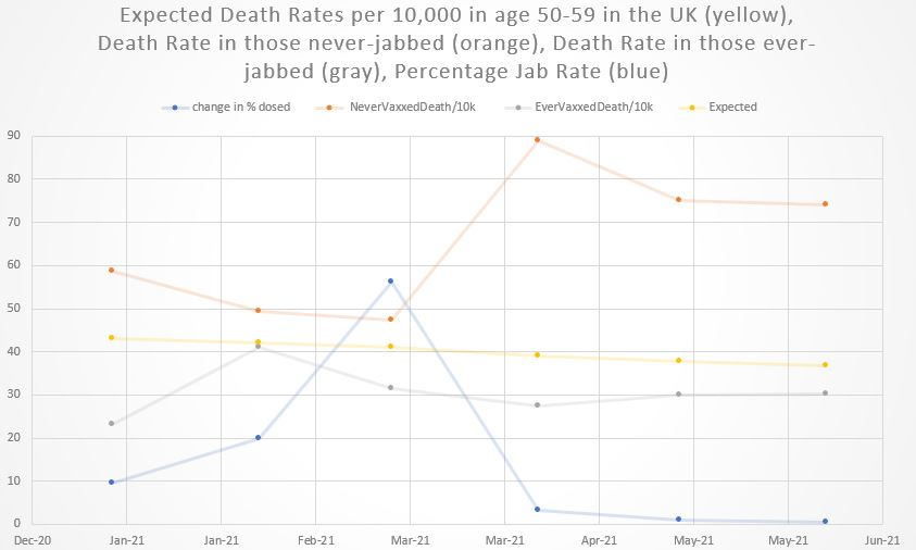
The top orange line is the death rate for never-jabbed, in units of yearly deaths per 10,000 (to scale it to the blue percentage jab uptake rate at bottom). The yellow line is a rough expectation of death rates based on age-specific rates from 2015, modified by a seasonality factor.
The gray line is the death rate for those who had ever taken a jab. Now let’s look at the same graph with notes in it:
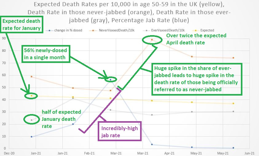
It’s just zany how it is that the January death rate was 50% below expectations for those who got jabbed — as if they took a super-vitamin wonder-pill that can magically cut baseline death in half (capable of making humans live twice as long as normal).
Also zany is the rate of jab uptake, with 56 of every 100 jabbed inside of a month. That unprecedented uptake led directly into a steep rise in death for those unjabbed though — in a calendar month which is not classified as a winter month (i.e., when excess deaths from respiratory infections are expected to occur).
That makes the steep rise in death rates following the jabs even MORE suspicious.
Notes on the shortcomings of the graphing tool: The first dot at left is January 2021, and the last dot at right is June 2021 — though the graph markings at bottom didn’t match up too well. Each singular dot represents the next month though.